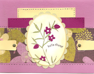

I stamped the top card on the left with gray ink and the bottom with black. I think I like the gray better.
Still loving the print paper I picked up --- this sketch really shows it off to advantage.
Somehow I couldn't leave it alone and had to add the stitching, bars and brads. Then I got out my punchies ... and on and on goes the story!


 ">
">


You have chosen to work with colors that I rarely use. Maybe I need to re-think my thoughts and give them another try. I agree, the gray is better.
ReplyDelete